www.aimmxi.xyz
Introduction
www.aimmxi.xyz is my website and currently my main computing project. It is a repository that documents all the significant things I have made, and it also serves as my own space on the internet.
Part of the reason of why I got into computing in the first place was the Internet. Back when I started using computers it was a different place full of interesting looking websites, original content and useful information spread throughout many many websites and forums. Nowadays, however, things have sadly changed for the worse and the internet has become a mess of automatically generated webpages with generic information, soulless corporate theming, advertising and tracking.
The aim of this project is to offer a platform in which I can post whatever I want in the format I want, to document what I make, preserve the things I deem important and, perhaps, make the Internet slightly less boring in the process.
Design and history
This website, as simple as it may look, has gone through many iterations throughout the years and has suffered several changes. Like a lot of projects, it started with a simple idea. Back when I started my studies on IT, I got acquainted on what programming and serious computer administration was like, and of course, a dash of web development was also included on the mix.
The concept of websites has always been very appealing to me and when I learnt about HTML and CSS I started to think how a website for my own ideas would look like. At first I had very novel ideas on how to build a website, despite having visited a fair amount of them with varying styles. I made an arcaic looking one for an assignment (Circa early 2019) that looked like this:
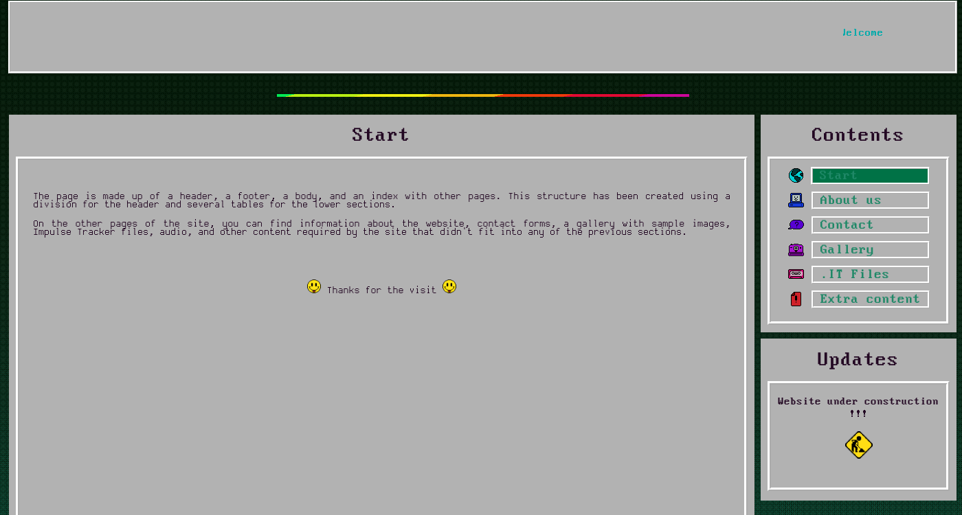
At this point I had no design principles, ideas or objectives set for what the website should look like or even serve, so it was a mess. I was ok with the way it looked at the time, but it was for a simple web programming/managing course and I had no purpose for it, so it sat in the back of my mind (And hard drive) for a bunch more years.
As time went by, a lot of things changed, and I started developing other hobbies. At some point I decided that I wanted to archive and publish the things that I made, but social media was rather simple and restrictive in terms of what could be expressed. I was thinking more of a blog than anything else.
I became more fluent in programming, interface design and more aware of core concepts of website management, hosting and look and feel. I did not want to use a content management system based on templates like Wordpress or Drupal because I wanted something more bespoke. After all, I had the knowledge to build it myself.
I set out to develop a custom website from scratch, like I did years ago. Only this time I had more knowledge and some actual guidelines to follow:
- Simplicity first and foremost: Complex systems are harder to manage. Usually you want something that is simple but actually practical, with some degree of automation. The pages must be simple yet functional.
- Minimize dependencies: The website should be portable. Ideally, setting the website up should be pointing a web server at the files and doing minimal configuration. I chose to avoid static website generators / PHP / web frameworks / Node.js for this reason.
- Keep the style consistent: Make all the pages look and feel the same. If something cannot be represented with already existing HTML structures or CSS classes, make a new one that blends together.
- Follow the same color theme and icon styles: In this case, black with cyan highlights.
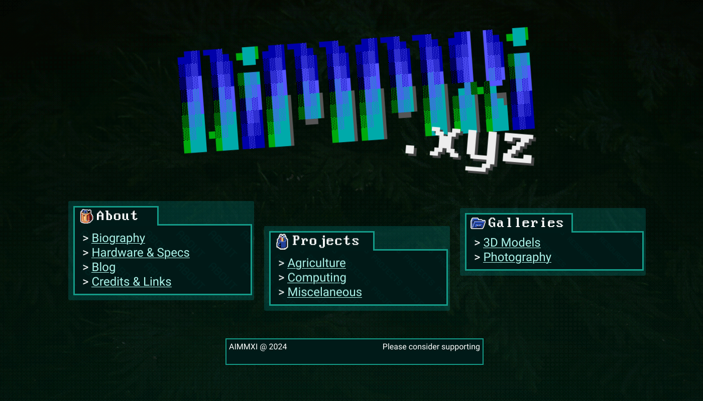
This second iteration of a website followed a more serious approach. Some care went into making sure that it looked consistent and some rules were defined beforehand. The initial design was discarded and everything was remade from scratch. This is how that more serious iteration looked (Note the similar color theme and retro style all throughout the pages):
I am all on minimalism so I went the pure HTML+CSS route with it, no client side JS code or server side shenanighans. It proved to be a bad choice in the long run because not everything a functional website should offer can be done with static files (At least not in a practical way).
It was hugely time consuming and productivity was very low at this point. I had very little time for development and some features like the navbar proved to be a huge pain to implement in pure HTML. After a few months of development I ended giving up on it because I did not like the retro theme and layout it had, plus it was tough to implement new things with how everything was layed out.
I sat down again on the drawing board and thought about the design and style of the website. On this third iteration, I decided to make it more modern looking, simplistic, portable and perhaps use a bit of minimalistic, bespoke JS to make my life easier. I replanned how most pages should be designed to make them more friendly and easier to navigate and I scratched the entire old website (With the exception of some CSS rules). The new guidelines are as follows:
- Simplicity AND usability first and foremost: Make it simple but not so simple that it hinders productivity.
- Minimize dependencies: No PHP or CMS but some minimal custom JS could be used for reactive behaviour.
- Keep the style consistent: Same as before.
- Follow the same color theme and icon styles: Black with cyan highlights, with more consistent icons (From the Breeze icon pack) and only certain retro elements so that the webpage does not look outdated.
- Keep future updates in mind: Make all the pages easy to modify or extend.
Since style and usability were the culprits of the previous version's failure, this new iteration would be more modern looking without completely throwing away the dashes of retro details, and would also include some minor JS for some details and ease of use. Responsiveness is taken into consideration as well, it is layed out to be much more phone or tablet friendly than the previous one and way easier to modify to support fluidness and full responsiveness in the future.
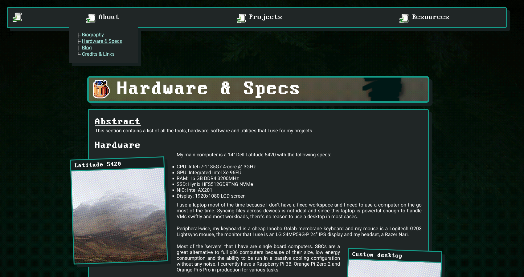
After a few more months of work, the third and to this day final iteration of the website was finished and published, which is what you are currently looking at.
Current state of the site
The site is currently split into a main index and 3 big sections. An about section for personal posts and information, a projects section for my main projects that have some thought behind and a galleries section for various assets and art related things like models, pictures... The site is really light on JS, with most pages only having some to render a common navbar and footer and maybe some animated text. The rest is built in plain HTML5 and CSS3, no Tailwind, no SCSS and no fancy stuff.
I feel a bit ashamed about doing things the noob and inefficient way instead of using some state of the art JS / PHP framework that would have made my life a lot easier; after all I have been on the IT industry for quite a long time and learning another language is not much of a burden. But on the other hand it has been a really fun challenge to work with some restrictions and try to work around static website limitations. This site might not serve as an example of peak web design with bleeding edge technology, but it has been a fun challenge and has made me learn a lot about web develoment and it's dos and do nots. It is my own bespoke mess and I like it.
I plan on updating the site both with new content and style. This is version 1.0 and it is only properly viewed with computers and perhaps tablets to some extent. I'm planning on adding full responsiveness and phone support in the near future, so stay tuned and follow my RSS feed if you want to know when something new arrives.
Thanks for the visit.
Links
Source code: